Le gai savoir – Fröhliche Wissenschaft
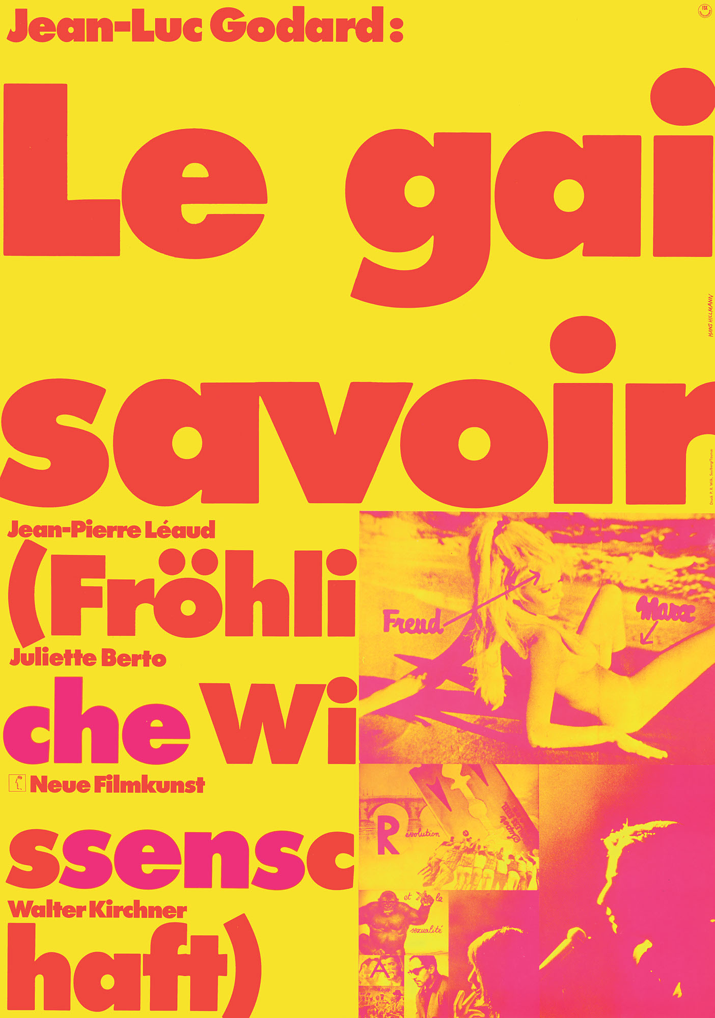
Jean-Luc Godards »Le gai savoir« hat bei mir ein Plakat angeregt, das aus lauter ›vorgefertigten‹ Teilen besteht. Die Typographie des Titels folgt einem Godardschen Einfall, der in dem Film vorkommt: man sieht das Wort ›Ange‹ (Engel), das die Leinwand ausfüllt. Dann fährt die Kamera zurück, und man sieht, daß sie vordem nur einen Ausschnitt aus einem längeren Wort, in dem das erste enthalten ist, erfaßt hatte: ›Danger!‹. Entsprechend habe ich im Filmtitel Worte in Worten aufgefunden und typographisch hervorgehoben, die mit dem Thema des Films zu tun haben. Die Photos samt ihrer ungewöhnlichen handschriftlichen Vermerke sind ebenfalls aus dem Film bzw. stammen von Godard. Zu tun blieb noch die Farbigkeit und die Anordnung der Teile zum Layout. Dafür habe ich das Prinzip der Aufteilung der DIN-Formate genutzt, das das Format immer wieder in der Mitte teilt, in diesem Fall bis zum DIN A 7, der halben Postkartengröße. (Hans Hillmann)
Jean-Luc Godard’s »Le gai savoir« inspired me to create a poster consisting of nothing but ›prefabricated‹ parts. The typography of the title follows a Godardian idea that occurs in the film: you see the word ›Ange‹ (angel) filling the screen. Then the camera moves back, and you see that it had previously only captured an excerpt of a longer word containing the first: ›Danger!‹. Accordingly, I found words in words in the film title and typographically highlighted words that have to do with the theme of the film. The photos and their unusual handwritten notes are also from the film by Godard. There was still work to be done on the colour scheme and the arrangement of the parts to the layout. For this I used the principle of splitting the DIN formats, which always divides the format in the middle, in this case up to DIN A 7, half the size of a postcard. (Hans Hillmann)